This week on It Figures… we continue our discussion on formatting graphs. I’d like to discuss a few software examples that many researchers use for presenting their quantitative data collection. Many people start out designing graphs using our favorite number crunching software Microsoft Office Excel. This is a basic piece of software you can use to report numbers (in table format which you can then chart into a visual graph) and calculate statistics such as standard deviation and standard error of mean. While Excel isn’t always exactly straightforward and easy to use, it does the job and makes it easy to share quantitative data with collaborators.
My favorite graphing software is GraphPad Prism. This software can be purchased online (although it can be a little pricey and you have to purchase a new license every year – https://www.graphpad.com/scientific-software/prism/). GraphPad is intuitive, simple and clear. When I say intuitive, I mean this program is really designed to plot your data quickly and accurately. I’m always impressed with how easy it is to plug in numbers, run easy stats, and produce a beautiful and precise graph. While many labs choose not to purchase this software, if you work in a field that requires a lot of number crunching and putting together figures for manuscripts this may be something you want to invest in.
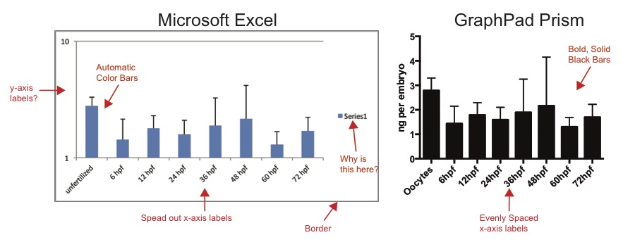
Take a look and see the difference! I put together this comparison of Microsoft Excel (left) and GraphPad (right) plotting the same data. What are your initial thoughts? Using the red text and arrows, I pointed out some differences. I don’t want to bad-mouth Excel (because I still use it a lot for numerical data), but I strongly believe the GraphPad prism graphs are aesthetically more pleasing and WAY easier to edit.
I’d like to continue this series of Formatting Graphs for the next two blog posts. We’ll focus on some key features of actually putting the graphs together next time.