This week on It Figures with Dr. Bec, we will continue our discussion regarding font choice. Last time we explored an overview of typography including basic formatting of fonts. For this post, I would like to delve a little deeper into incorporating some formatting techniques into your manuscripts. First things first: Always check the journal guidelines for required fonts. If you don’t have these fonts on your computer, you should be able to download them or contact the journal editing department for assistance. Then STICK to the requisite font(s). A huge pet-peeve for many scientists is lack of consistency with font choice. There can be exceptions to this rule (i.e. the journal requests texts to be written in a different font than the figures) but overall, format your entire document using the required font.
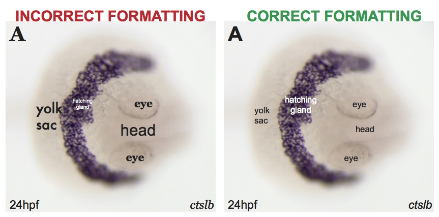
Let’s take a look at the same figure with different formats (see figure/inset below). At first glance, both panels present the same information. Upon further investigation, you can see that the left panel contains numerous fonts, sizes, and typographical emphases (bolding, italics, underlining). This is distracting when you compare it to the right panel, which again contains the exact same information, but is presented in a clean, consistent format. Always remember to keep it simple!

While I am a person who has an eye for varying font choices, not everyone has this ability to easily see these discrepancies. If you are not, then utilize an editing service or colleague to skim over your document. You are pouring your heart and soul into your research, which makes it even more important to present it in a clear manner to your audience. You don’t want your readers to be distracted by poor formatting – the focus should be your research.
Next time on It Figures with Dr. Bec, we will start to take a look at graph formatting.